Single Post Layout
Thursday, October 3, 2024
Due to the Blogger's limitations creating a split column post layout requires inserting an additional HTML tag straight into the post using Blogger's HTML editing mode.
There are two ways of tackling this task:
There are two ways of tackling this task:
1. Equal colums solution
Start off with adding a simple CSS snippet to the theme's code:
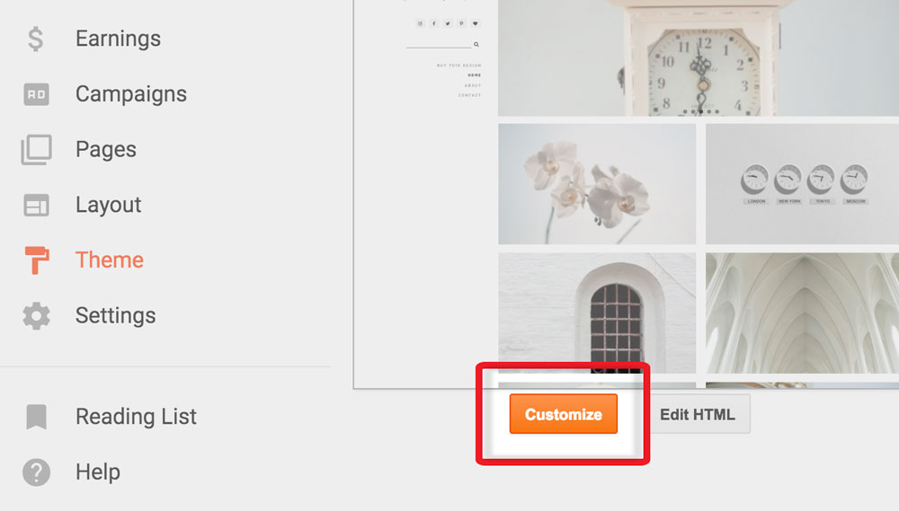
1. Go to the Blogger Theme Designer (it can be accessed through the "Customize" button in your Dashboard)

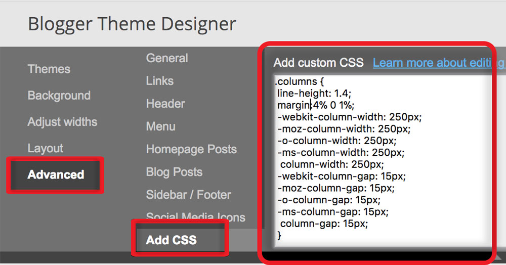
2. Select the "Advanced" tab and then click the "Add CSS" link in the secondary menu.
Paste the snippet provided into the "Add custom CSS" box.
Paste the snippet provided into the "Add custom CSS" box.
.columns {
line-height: 1.4;
margin:4% 0 1%;
-webkit-column-width: 250px;
-moz-column-width: 250px;
-o-column-width: 250px;
-ms-column-width: 250px;
column-width: 250px;
-webkit-column-gap: 15px;
-moz-column-gap: 15px;
-o-column-gap: 15px;
-ms-column-gap: 15px;
column-gap: 15px;
}
line-height: 1.4;
margin:4% 0 1%;
-webkit-column-width: 250px;
-moz-column-width: 250px;
-o-column-width: 250px;
-ms-column-width: 250px;
column-width: 250px;
-webkit-column-gap: 15px;
-moz-column-gap: 15px;
-o-column-gap: 15px;
-ms-column-gap: 15px;
column-gap: 15px;
}

3. Click "Apply to Blog" button in the top left corner.
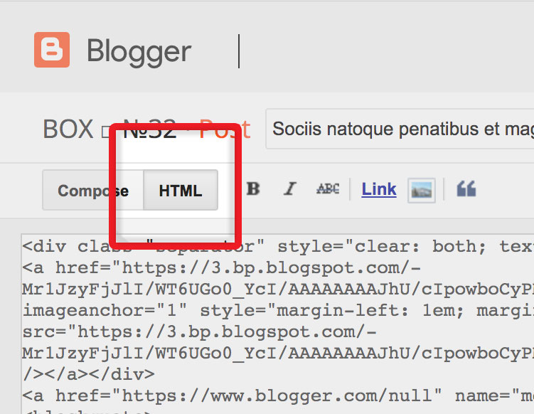
4. Go to your post editor and switch to the HTML view.
5. Wrap your content in a div or a blockquote and add a "column" class to that element:
4. Go to your post editor and switch to the HTML view.
5. Wrap your content in a div or a blockquote and add a "column" class to that element:
<div class="columns">
Text text text text...
</div>
Text text text text...
</div>
or
<blockquote class="columns">
Text text text text...
</blockquote>
Text text text text...
</blockquote>

2. Bootstrap Grid method
If you are using one of the Blogger themes from the FlyBird's Box Collection, you can take advatage of the preinstalled Bootstrap grid layout.
Splitting content this way may be slightly more time consuming but will give you a full control over the size of the columns in return.
Go to your post editor and switch to the HTML view.
Format your content in a following way:
<div class="col-sm-12 col-md-6" style="float:left">
Text text text...
</div>
<div class="col-sm-12 col-md-6" style="float:left">
Text text text...
</div>
<div style="clear:both"></div>
Text text text...
</div>
<div class="col-sm-12 col-md-6" style="float:left">
Text text text...
</div>
<div style="clear:both"></div>
You are free to change the col-md- values to adjust the ratio of the split.
-> More information on the Bootstrap Grid Layout


No comments :
Post a Comment